
nutreat
UI/UX DESIGN / 2021 / TOOLS: ADOBE PHOTOSHOP, ILLUSTRATOR
For CalArt's 4-week course "Visual Elements of User Interface Design" on Coursera, I was instructed to create an idea for a smartphone app from scratch and draft its essentials: creating the look and feel, pattern library, and finally, a static interface.
The challenge for me was ideating an app interface with the user’s experience in mind, to not only solve a practical problem, but solve an emotional problem, as well.
I looked to my own experiences of what app I wish existed, along with all its possible features, and came up with Nutreat. As someone with multiple food allergies (13 known allergies, and some intolerances…!), I struggle with dining out, whether it’s looking for a restaurant that would have safe options for me, or looking for a specific dish that I’m craving (and is still safe, of course). I wanted to make an easy solution to my everyday food dilemmas.
Practical problem: finding a specific product or locations (i.e. restaurants, bakeries, stores) where the user can acquire the product based on their preferences. Emotional problem: finding a product/location without the time and energy consuming process.
|
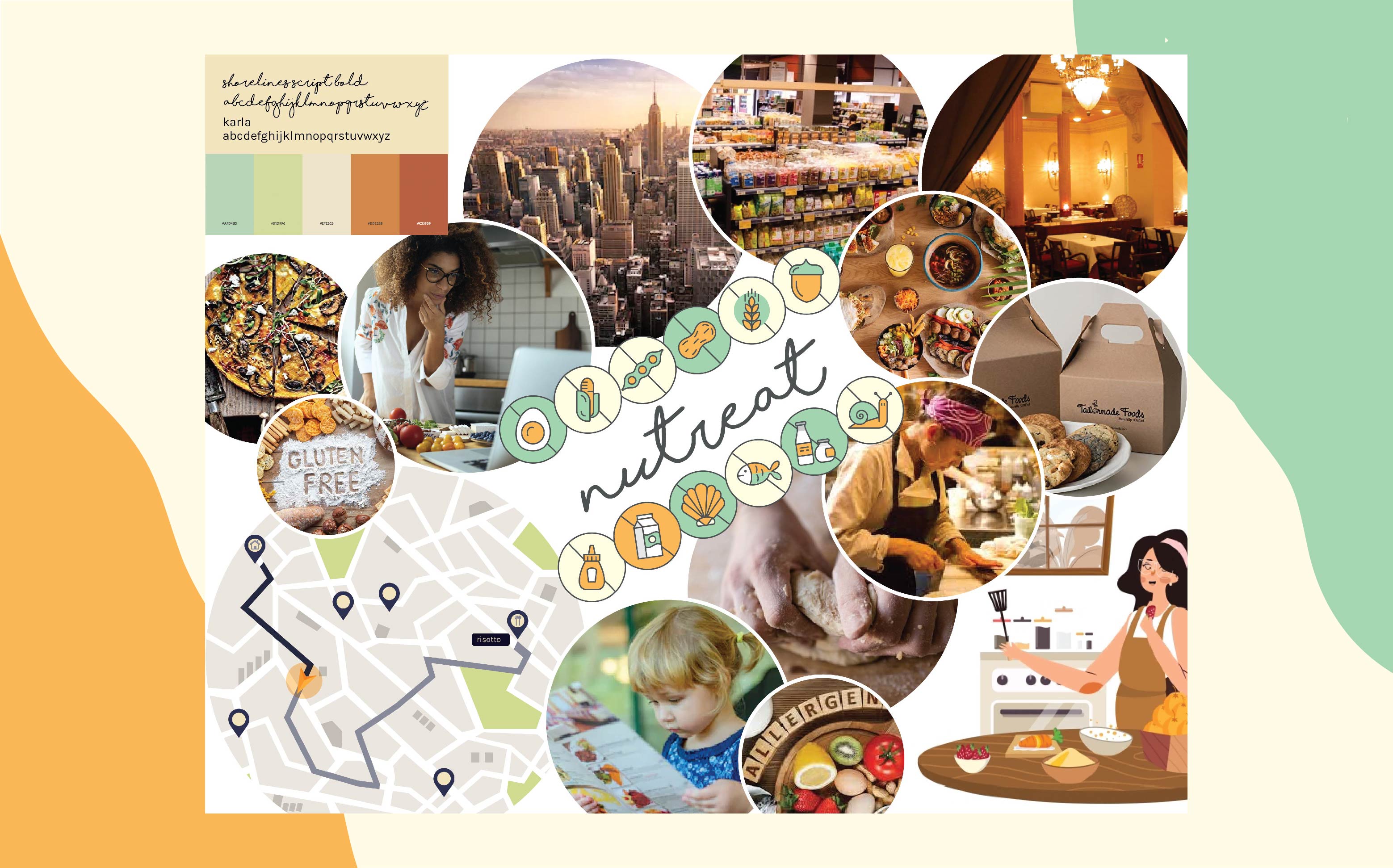
LOOK AND FEEL The first step was to create a moodboard that answered three main questions about the app: what is it, who is it for, and where does it live.
|
|
|
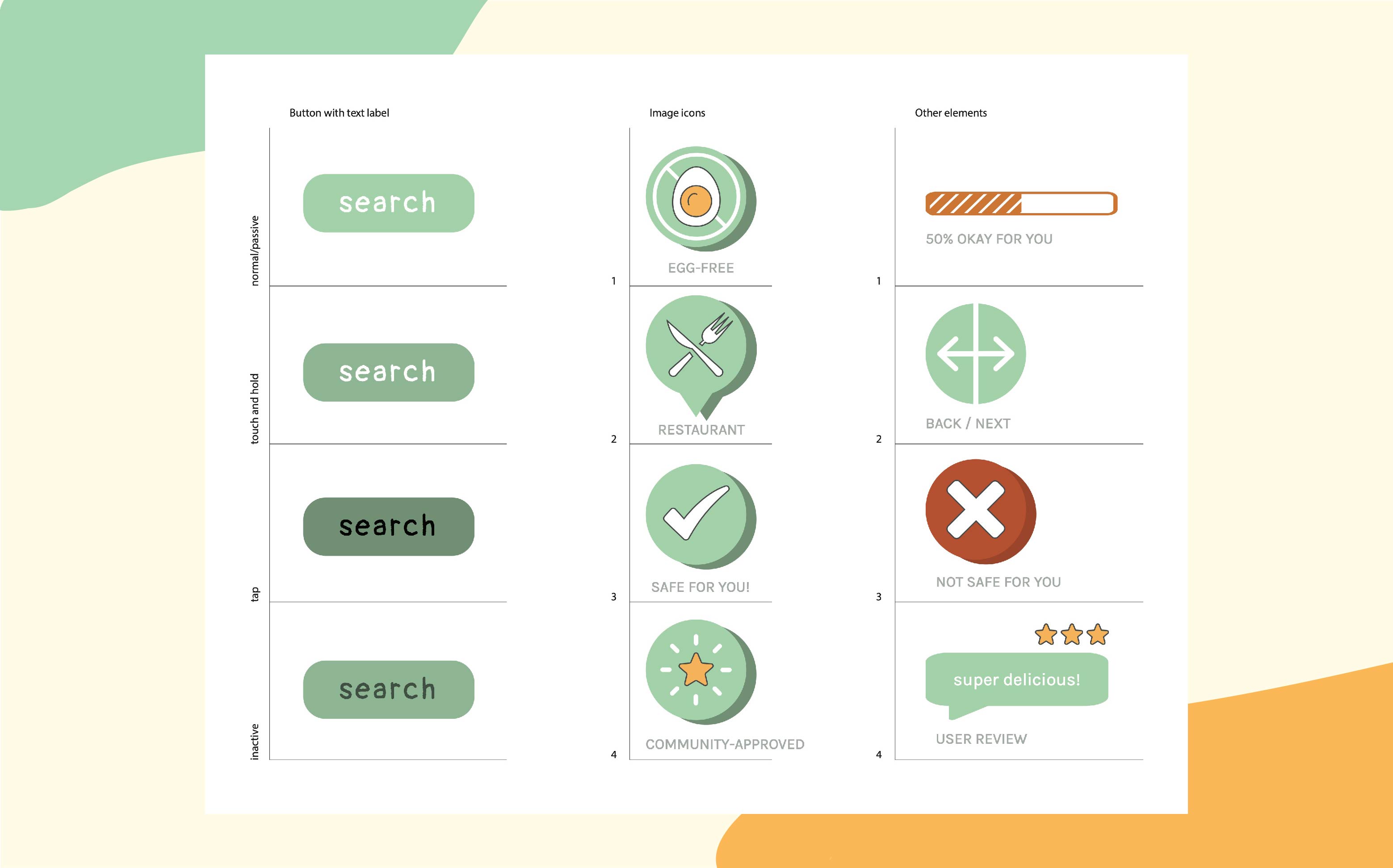
ICONOGRAPHY In this image, I've created a pattern library using the palette and typefaces from my mood board. I chose to depict the "search" button, as it is the main function of the app. The typeface (Pangolin Regular) for the main buttons is personal and carefree while maintaining legibility. This comes from the personality that I would like Nutreat to convey: personal, carefree, and easy-to-use. |
|
|
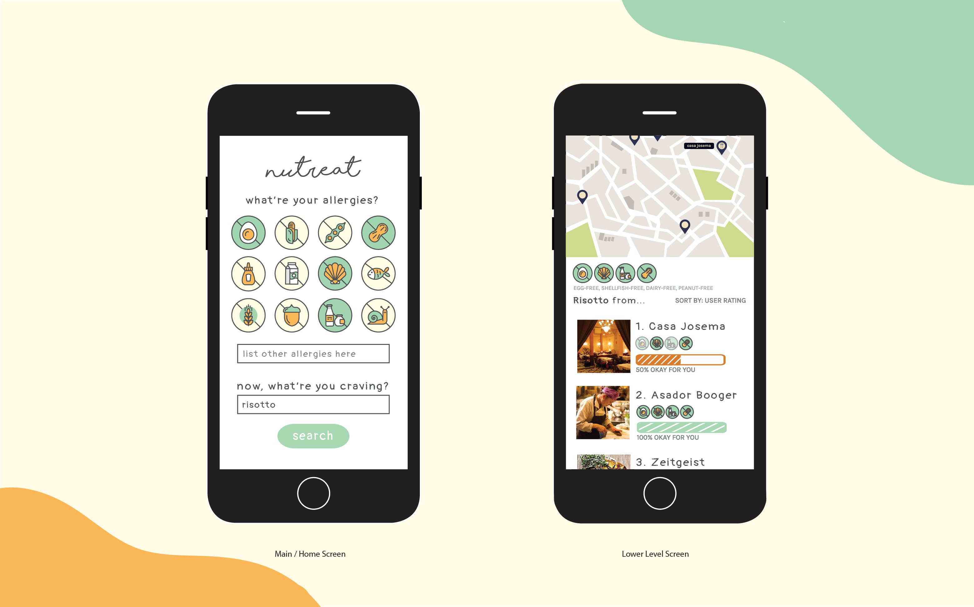
FINAL SKETCH: STATIC INTERFACE The final stage was to layout the User Interface design for the Home Screen and Lower Level Screen. You immediately select your allergies from the Top 12 allergens, or write them in. Then, you write a dish or ingredient you’re craving. In the next screen, you see a map of the nearest places that have your craving, with a rating of how safe it is for you based on your allergies and the ingredients the restaurant uses. The ingredients would be known from a database built by users like you and participating locations. You can also sort by user rating, safe-for-you score, or distance from you! |
|
|
OVERVIEW In the end, I came up with solutions for both the practical and emotional problems that Nutreat addresses. To solve the practical problems, I designed a concept with specific functions: 1) Search for a specific product and find locations (i.e. restaurants, bakeries, stores) where the user can acquire the product based on their preferences. To solve the emotional problems, I created a look and feel that is inviting, personal, and carefree to address the user’s typical distress when looking for food with dietary restrictions. Currently, there are about 32 million people who have food allergies in the U.S., and all of them have alarmingly very little resources to make daily living easier. The reality of living with allergies is that you are trying to survive, rather than deservedly thrive as a person without allergies. With these solutions, Nutreat can help people nationwide to thrive a little more (to have their cake and eat it, too), and have a newfound peace of mind about their food. |
|